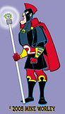
I had a real burst of creativity around 2004/2005, as far as beginning to find my voice and how the pencil naturally wants to move with the hand. As I stated earlier, I can try to do the "edgy" thing, but am never that happy with it. This style is cartoony, but not so "simplified" and abstract...somewhere between. It has its pitfalls. And I'm really trying to find a project with which to do something with it. Would it "sell" in today's comics market? Who knows?!
I thought I had a project and publisher, but it didn't work out. And while they have their version, I do, as well. And if the truth were told, we both had some demons to overcome. I did a lot of character designs that I like for said project, and when it fell through, I was in the doldrums. Then I went to the doctor to find out my hands were "dying." After some surgeries and therapy, I now find myself a few years later not better from the wear, but kind of back at square one looking for a personal artistic voice. But enough whining, here's one of my better designs for a character. Don't know what I'm going to do with him as yet, but we'll see...
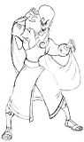
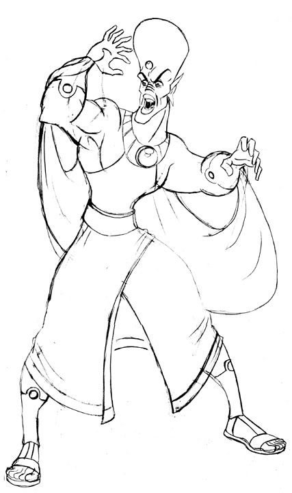
I've received some comments on my "Martian" guy. I admit to him having some inspiration from not only the "Outer Limits," but also "Lost in Space." Guess I like big-headed aliens. His look was inspired by one of Yul Brenner's costumes in the "10 Commandments," so he has an Egyptian feel, too. Getting back in the mindset of this style, I realized I was drawing too may lumps and bumps, and that the anatomy needed to be more streamlined. Here's how the pencil drawing turned out...
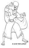
While non-photo blue has been a standard for a long time, I don't like the blue, but prefer warmer colors. Photoshop and Pagemaker have simplified this process for me. I place the pencil tiff in a Pagemaker document and print it out red at 15%. After inking it, I scan it in RGB, then tweak the levels and change the mode to CMYK. After that I get rid of all the channels except the black one, change the mode to grayscale, then to bitmap at 600dpi. Here's my inked version.
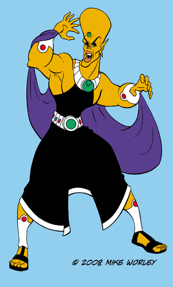
I'd go into all the details of doing up the color, but you can read up on it from an expert by purchasing Brian and Kristy Miller's book, "Hi-Fi Color for Comics." Brian is the best in my opinion. And yes I'm biased as the book does contain a lot of art by yours truly. Any way, here's a working version with some flat color.
Sorry for the infrequency in posting. I've been extremely busy of late, and will be playing evil Pontius Pilate in my church's Resurrection Sunday drama. I may post some pictures. Be warned...it will be a fat guy in a toga.
PS--Happy Purim!!!


2 comments:
cool to see a finished piece!
Mike I'm liking what your doing with these characters. You need to do something with them.
Coffee next week?
Monte
Post a Comment