The assignment was to do storyboards to either "Mayhem at Prom," or "Dogs and Cats Fight." I chose to do both...somehow. As I stated earlier, two of my favorite things to draw are chicks and monsters, so the idea popped into my head that prom night would be at high school for "cat people." Couple that somehow with werewolves, and I would accomplish both scenarios.
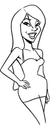
To begin with a main character was the first hurdle. While I like the "Disney princess" look, I wanted somethings a bit more angular, maybe a little more Bruce Timm. In designing the first character here's what came out of my pencil...

I thought she looked a lot like my friend, Taryn, so I began there.
The play on the joke was the idea of the "first time," or losing one's virginity on prom night. I wanted to play up that angle, having a bit of sexual tension. But the "first time" for a student at Simone Simon High School was to get their "first kill!" So the girls in question(that includes the ginger cat) had located dates from out of country--two foreign exchange from Wales. This idea came from 2 foreign exchange students I worked with this past summer. They were from Slovakia, and I waffled in nicknaming them either "Boris" and "Igor," or "Count Dracula" and "Baron Frankenstein." Their real names are "Michel" and "David." Unbeknownst to the girls, their dates were actually werewolves and were trying to score their first kills, as well. Although the one would like to score before he kills. But I blather on way too much.
For some reason, Blogspot cuts off part of the scene. To see it entirely, double click it, and it will take you to Photobucket, where you can see the proper aspect ratio. And, yes, it's a really big file. Here's the final outcome...

2 comments:
All Right, MIKE! That looks great!!
Mikem thank you for art for "Master Digital Color" book!
Post a Comment